
Tuesday, November 20, 2018

Thursday, November 8, 2018
Heidi Week 5 - Poster Line art
Here's the inked version of my line drawing, for a Pushing Daisies poster
 I made some complicated overlapping choices in my composition, so I used varied contour lines to reinforce whats in front of what and help create depth.
I did a much better job of not over-lining these faces, than in the sketch cards. It was fun to practice making those tough choices and remembering that my work as an artist includes simplifying for the sake of concept curation and storytelling. I'm happy with this so far, excited to put the color in.
Here's my photobashed reference:


I did a much better job of not over-lining these faces, than in the sketch cards. It was fun to practice making those tough choices and remembering that my work as an artist includes simplifying for the sake of concept curation and storytelling. I'm happy with this so far, excited to put the color in.
Here's my photobashed reference:

I didn't do any tonal corrections to this photobash, with the exception of the grass background. I'm doing a sepia value lay-in, so it'll be fun to watch my poster emerge with greater color unity than in my reference.
Sunday, November 4, 2018
Week 6 - tones to color notes
This is my poster demo continued.
Video is here
Step 1 - Last week we traced the photo reference that we created. This week we'll start by hand drawing on top. Clean up the drawing and hand draw some things so that it doesn't look too traced. Make design decisions such as where to use straight lines, where to use curves. Where to use hatching, stippling, or other techniques to indicate the edges of where shadow patterns change. Indicate the planes of the faces. Don't draw too many lines including hatch marks on young characters and attractive female faces because it will make them look old really fast. Characters should have more straight lines if they are older and or more masculine. Linda Hamilton from Terminator 2 for example is one heck of a femme fatale so it's not just limited to guys only.

Step 2 - add tones to a layer below the line art layer. I eyeball values using a desaturated version of my photo reference. Make more decisions on how to control contrast. My reference is darker but the indie film this is for has a hopeful ending so I made the decision to brighten up the overall values of the poster so that it won't look too sinister. I love the half shadow on the house but I decided to remove and use a soft ambient light instead because the ending is more light-hearted and not as dark or overly dramatic. Remember that "making artistic decisions" is what makes a piece look hand done. For the sky, it's common practice to just paste a photograph in and use it like a texture clipped to the sky shape below. Notice that the top is dark, but the bottom is lighter. That is my way of hinting about the overall direction and tone for this specific film. My choices are intentional for the purpose of this specific story. Don't make arbitrary decisions. Try to find a reason for your choice of lighting whether it is high contrast for a very dramatic film, or softer for a more dreamy or hopeful story.

Here's my photo reference:
I purposely don't edit the heck out of my photo reference because I want to leave room when I hand draw things to make decisions. And sometimes I don't even care if my photo reference is poor as long as it'll help me get close. The main actor on the top left for example, I wanted this head angle but couldn't get a good photo reference so this reference is good enough, plus I like the side light because he starts out in turmoil.

Step 3: Use a layer on top of the tonal value set to the color layer mode. This adds color to our existing tones without changing the values. This is a safe method to make sure the values are good first before going to color. Get the colors as close as you can to what you have in mind. Then use the Camera Raw filter to adjust sliders to get them to the finish level. For color palette, I usually like to use a split complimentary. So instead of using blue and orange, I use the color that's next to blue towards green so I get teal. I didn't want to use too much of red and green directly because it would be too much Christmas looking. I tried purple and it looks good too but I think teal and orange will be more eye catching to the general audience who have no idea what this film is about. I think about the purpose of the poster. In this case, the short 12 minute short indie film might not even have a trailer so this poster has to get people interested enough to want to check out the movie. This is a real world example and the film is currently being edited. This is the final poster. I try really hard to make good decisions but NOT noodle it to death. The drawing, toning, and coloring took about an hour and a half each.

Here is how I organize my work file. Let me know if you have any questions.
Photoshop layers
Solid black layer set to color layer mode to check values
Copy Merged layer (of all of the below layers) with Camera Raw filter adjustments
Copy Merged layer (of all of the below layers)
Color Dodge or Screen layer on top to highlight focal area
Color hold layer (clip to line art layer and fill with a dark color like a dark skin tone or cool color)
Line art
Color (clip to flat gears flat shape, layer set to color layer mode)
Tones (clip to flat gears shape)
Flat shape (gears)
Background texture (set to overlay or multiply)
Background solid
Notes:
Part 1 - Draw
First we "created" our reference by making the photo collage/photo-bashing. Then we traced it to get a rough drawing. In order to make it look hand drawn, we hide the photo reference and hand draw more details and edit that rough drawing.
Part 2 - Add tones
Part 3 - Add color using a layer set to color layer mode. Use layer modes such as screen, overlay, and color dodge to make your colors and tonal contrast look good. Use an overlay or multiply layer to add a global texture to make things look less flat and more organic. I use two because I wanted to vary the texture intensity on the art from the subtle texture of the paper background.
The color hold layer clips to the line art layer and is filled with a color that you want your lines to be instead of a solid black. This helps soften the "ink" lines, thus moving it closer to a softer edge drawing and closer to being a painting or photograph.
This is not the only way to do it, so if you have another way you would like to use, please do. The main point is that you should have a way to check your values even after adding color. I hope this is helpful. Let me know if you have any questions.
Tuesday, October 30, 2018
Week 6 - part one: adding values
Hi guys,
After week 5 from creating a rough line drawing, the next step is to add tones. Here are three samples of that process.
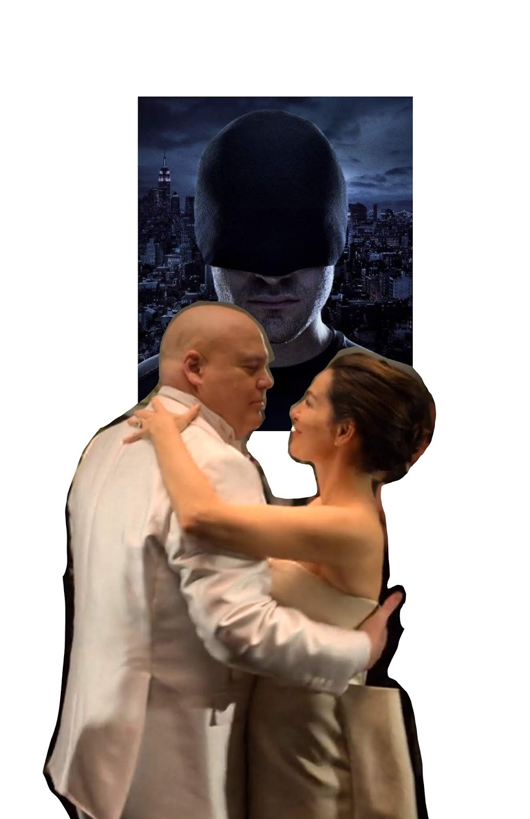
This one is for Netflix's Daredevil season 3. There's a moment when the crime boss, the Kingpin gets married that summarizes up the season well. This is the same process that I showed from week 5.
Step 1 - think of an idea
Step 2 - find (or create) photo reference using photobashing
Step 3 - trace the photo for a line drawing (even though we're "tracing", check the drawing once in a while by hiding the photo reference and make sure that it looks good. Do flip the image to double check)
Step 4 - add tones underneath the line drawing
Step 5 - adding color and using texture (i'll demo this in a video in the next post)


After week 5 from creating a rough line drawing, the next step is to add tones. Here are three samples of that process.
This one is for Netflix's Daredevil season 3. There's a moment when the crime boss, the Kingpin gets married that summarizes up the season well. This is the same process that I showed from week 5.
Step 1 - think of an idea
Step 2 - find (or create) photo reference using photobashing
Step 3 - trace the photo for a line drawing (even though we're "tracing", check the drawing once in a while by hiding the photo reference and make sure that it looks good. Do flip the image to double check)
Step 4 - add tones underneath the line drawing
Step 5 - adding color and using texture (i'll demo this in a video in the next post)


This one is for the Hannibal Series

after you photobash, desaturate the reference to help you see values.


This one is for Mad Max Fury Road


That's it for now. Let me know if you have any questions.
Saturday, October 27, 2018
Iterative art - Stranger Things
Generative art is good when our job is to design and create something new every day. However, I do believe it's more successfully executed by more advanced artists. Not to say that it's not worth experimenting with. However in this class I would like to emphasize the idea of producing iterative art instead. It is also a part of design that is important and I believe it's a faster path to a successful piece of art for the general public audience to grab.
This is because they are already familiar with the source material. Check out the iterative poster art made for Netflix's Stranger Things using popular 1980's films as a reference source. Enjoy!
Try this Heidi:
https://www.highsnobiety.com/2017/09/15/stranger-things-80s-movie-posters/
These are also amusing.
https://www.dailydot.com/parsec/daredevil-season-2-caravaggio-posters/

This is because they are already familiar with the source material. Check out the iterative poster art made for Netflix's Stranger Things using popular 1980's films as a reference source. Enjoy!
Try this Heidi:
https://www.highsnobiety.com/2017/09/15/stranger-things-80s-movie-posters/
These are also amusing.
https://www.dailydot.com/parsec/daredevil-season-2-caravaggio-posters/

Wednesday, October 17, 2018
Heidi Wk 4B V2
While I'm letting poster ideas percolate in my brain, I felt inspired to do another portrait... so, I figured I might as well post it here :-D
 Reference:
 This is one of those cool moments where I think the drawn piece is way more interesting than the reference picture. Had fun with this one.


Thursday, October 11, 2018
Heidi Week 4 B - Portrait
"Always check the line art before rendering" Ngyuen already told me in reference to this piece. Dang. In painting, I didn't draw first... it was all rendering, and if the lines didn't look right after the first pass, or second, or third, I'd just keep adding paint and re-rendering until it looked right.
I'm still proud of my work. I wouldn't have even known where to begin trying to accomplish this piece 6 weeks ago. I made some alignment mistakes, But this is the first time I think I've ever rendered in charcoal well (I think aside from those facial isolation studies, the last time I used charcoal was like 20 years ago!). It seems to read as exactly who its supposed to be, and I'm looking forward to practicing more and correcting the mistakes I did make.
Plus, who doesn't like spending a few hours gazing at Mr. Mmmmmomoa? :-P


I'm still proud of my work. I wouldn't have even known where to begin trying to accomplish this piece 6 weeks ago. I made some alignment mistakes, But this is the first time I think I've ever rendered in charcoal well (I think aside from those facial isolation studies, the last time I used charcoal was like 20 years ago!). It seems to read as exactly who its supposed to be, and I'm looking forward to practicing more and correcting the mistakes I did make.
Plus, who doesn't like spending a few hours gazing at Mr. Mmmmmomoa? :-P

Reference:

Wednesday, October 10, 2018
Leen - Wk 3 - Convention Sketch

I've done convention sketches and commissions before and it's always been requests for portraits and such. I normally go tighter on such things but I'd like to paint loosely going forward. It's more fun this way. =)
Not too happy with the way I rendered the background on this. Unintentional sunset effect. It's supposed to be a bittersweet moment. The objects above their head being items from the episode with meaning. ANYYYYWAAY, I enjoyed making this.
References: "The Visitor" - Star Trek: Deep Space Nine episode (season 4, episode 3)
Tuesday, October 9, 2018
Week 5 - posters part 1/2
Here's week 5 video lecture.
https://youtu.be/B4SoM2oNGgY
For this week I want you to follow my development process from the video and get the rough line art for your poster done. We'll finish the poster next week.
Step 1 - Define your project (movie poster, dvd/blu-ray cover, band/concert poster, book cover, etc.) Define what the typical size format is for the final product. My demo is for an indie movie poster. They usually print 11"x17" in size. Create your file based on your size and select at least 300dpi resolution. Think about what the overall feeling for the poster would be. Is the project about a sad drama or high octane action?


Step 6 - Trace your photobash to create a rough line art, but make decisions on where to use straight lines and curve lines. Draw less detail in areas that are further away from main focal points, and more details in focal points to guide the audience's eyes.

Notes: How to use clipping mask in photoshop
Set your layers so that the image you want to show is on the top layer, and your mask shape is on the bottom layer like this:


 The second way you can get to it is in the menu drop down in the top right of the layers palette. The third way is to just hold Alt on PC and click the area between the two layers:


After you clip it, everything in the black area of the mask will show the image from the layer above! It's magic!

https://youtu.be/B4SoM2oNGgY
For this week I want you to follow my development process from the video and get the rough line art for your poster done. We'll finish the poster next week.
Step 1 - Define your project (movie poster, dvd/blu-ray cover, band/concert poster, book cover, etc.) Define what the typical size format is for the final product. My demo is for an indie movie poster. They usually print 11"x17" in size. Create your file based on your size and select at least 300dpi resolution. Think about what the overall feeling for the poster would be. Is the project about a sad drama or high octane action?

Step 2 - Find inspiration (other posters/covers that you love). Extract design characteristics that you want to utilize in your own work.

Step 3 - Do three thumbnails for your poster. Select your favorite and do an iteration.

Step 4 - Find references. Who is the cast? Find camera angles that match your final thumbnail. Don't get too many images that are not useful. Only save useful images.

Step 5 - Photobash (create your own reference to work from)


Set your layers so that the image you want to show is on the top layer, and your mask shape is on the bottom layer like this:

Here's a close-up of the layers palette to show that the image is on a layer above the mask layer.

There's three ways you can get to it. One is in the layer menu:


After the image layer is clipped, you'll see that the layer icon shifts to the right and there's an arrow pointing down to the left of it.

After you clip it, everything in the black area of the mask will show the image from the layer above! It's magic!

Sunday, October 7, 2018
How to price commissions
Heidi had a great question on how to price commissions recently.
I take the wage that I'm okay with and multiply it by the average time it takes me to complete the request. Another great way to gauge pricing is to look at how other comparable artists price their work.
So let's say I'm willing to work for no less than $25 per hour if I like the requested subject matter, and I think the piece will take me 5 hours, then I'll charge $125.
Here is another factor: how much do I like or dislike the requested content? If I politely want to refuse work, then I just charge a higher rate like $50 per hour, hopefully high enough to make them not want to say yes.

I take the wage that I'm okay with and multiply it by the average time it takes me to complete the request. Another great way to gauge pricing is to look at how other comparable artists price their work.
So let's say I'm willing to work for no less than $25 per hour if I like the requested subject matter, and I think the piece will take me 5 hours, then I'll charge $125.
Here is another factor: how much do I like or dislike the requested content? If I politely want to refuse work, then I just charge a higher rate like $50 per hour, hopefully high enough to make them not want to say yes.

Here's a link to wages from the animation guild. These are studio rates, and freelance rates are a little higher but if you're new then I wouldn't go too much higher or at all if it's hard to land real gigs.
http://animationguild.org/contracts-wages/
Another note is that comic book artists generally make a little less than animation and film artists. That is another factor to consider.
Two facebook groups also are great for informing on commission and art prices for comics:
sketch prices - comic book sketches, commissions & autograph prices
This group tends to post art from higher end and popular artists in the industry so prices are usually a bit higher than average.
Connecting Comic Book Writers and Artists
This group usually lists mid to low level artists, and sometimes are priced too low in my opinion but they also include outsourcing from other countries.
Hope this helps.
Thursday, October 4, 2018
Heidi Wk 4A - Composition Studies


Subscribe to:
Posts (Atom)