This track is for students who wish to create book/comic covers, posters, sketch cards, and convention sketches. We will focus on single images. Class topics include how to find good reference, graphic compositions., guiding the audience’s eyes, figure drawing, practical perspective, designing graphically, practical templates, how to approach design, how to generate ideas when you have art block, how to portray mood with lighting and color, rendering, and how to develop style,
After week 5 from creating a rough line drawing, the next step is to add tones. Here are three samples of that process.
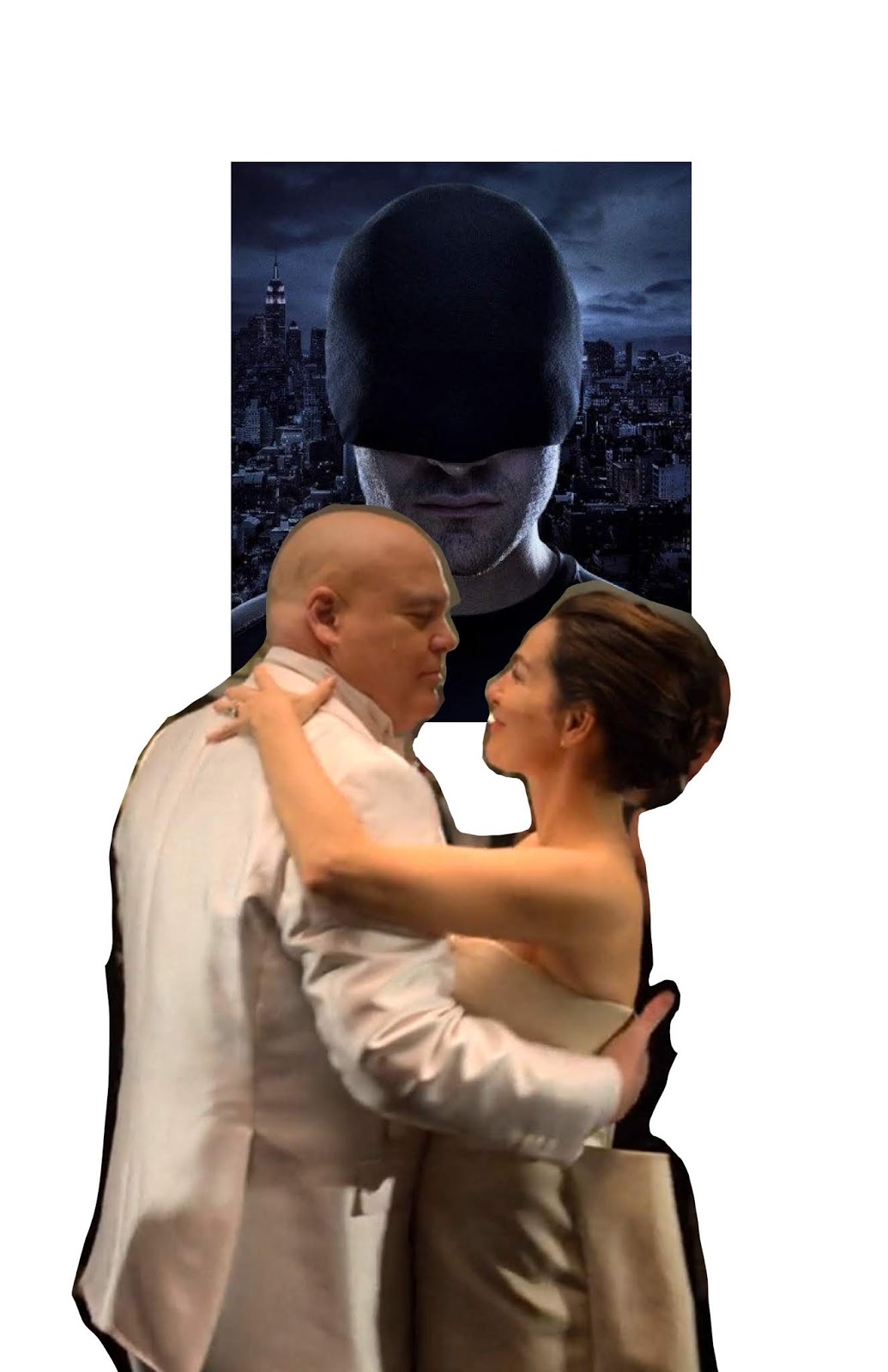
This one is for Netflix's Daredevil season 3. There's a moment when the crime boss, the Kingpin gets married that summarizes up the season well. This is the same process that I showed from week 5.
Step 1 - think of an idea
Step 2 - find (or create) photo reference using photobashing
Step 3 - trace the photo for a line drawing (even though we're "tracing", check the drawing once in a while by hiding the photo reference and make sure that it looks good. Do flip the image to double check)
Step 4 - add tones underneath the line drawing
Step 5 - adding color and using texture (i'll demo this in a video in the next post)
This one is for the Hannibal Series
after you photobash, desaturate the reference to help you see values.
This one is for Mad Max Fury Road
That's it for now. Let me know if you have any questions.
Generative art is good when our job is to design and create something new every day. However, I do believe it's more successfully executed by more advanced artists. Not to say that it's not worth experimenting with. However in this class I would like to emphasize the idea of producing iterative art instead. It is also a part of design that is important and I believe it's a faster path to a successful piece of art for the general public audience to grab.
This is because they are already familiar with the source material. Check out the iterative poster art made for Netflix's Stranger Things using popular 1980's films as a reference source. Enjoy!
"Always check the line art before rendering" Ngyuen already told me in reference to this piece. Dang. In painting, I didn't draw first... it was all rendering, and if the lines didn't look right after the first pass, or second, or third, I'd just keep adding paint and re-rendering until it looked right.
I'm still proud of my work. I wouldn't have even known where to begin trying to accomplish this piece 6 weeks ago. I made some alignment mistakes, But this is the first time I think I've ever rendered in charcoal well (I think aside from those facial isolation studies, the last time I used charcoal was like 20 years ago!). It seems to read as exactly who its supposed to be, and I'm looking forward to practicing more and correcting the mistakes I did make.
Plus, who doesn't like spending a few hours gazing at Mr. Mmmmmomoa? :-P
I've done convention sketches and commissions before and it's always been requests for portraits and such. I normally go tighter on such things but I'd like to paint loosely going forward. It's more fun this way. =)
Not too happy with the way I rendered the background on this. Unintentional sunset effect. It's supposed to be a bittersweet moment. The objects above their head being items from the episode with meaning. ANYYYYWAAY, I enjoyed making this.
References: "The Visitor" - Star Trek: Deep Space Nine episode (season 4, episode 3)
For this week I want you to follow my development process from the video and get the rough line art for your poster done. We'll finish the poster next week. Step 1 - Define your project (movie poster, dvd/blu-ray cover, band/concert poster, book cover, etc.) Define what the typical size format is for the final product. My demo is for an indie movie poster. They usually print 11"x17" in size. Create your file based on your size and select at least 300dpi resolution. Think about what the overall feeling for the poster would be. Is the project about a sad drama or high octane action?
Step 2 - Find inspiration (other posters/covers that you love). Extract design characteristics that you want to utilize in your own work.
Step 3 - Do three thumbnails for your poster. Select your favorite and do an iteration.
Step 4 - Find references. Who is the cast? Find camera angles that match your final thumbnail. Don't get too many images that are not useful. Only save useful images.
Step 5 - Photobash (create your own reference to work from)
Step 6 - Trace your photobash to create a rough line art, but make decisions on where to use straight lines and curve lines. Draw less detail in areas that are further away from main focal points, and more details in focal points to guide the audience's eyes.
Notes: How to use clipping mask in photoshop
Set your layers so that the image you want to show is on the top layer, and your mask shape is on the bottom layer like this:
Here's a close-up of the layers palette to show that the image is on a layer above the mask layer.
There's three ways you can get to it. One is in the layer menu:
The second way you can get to it is in the menu drop down in the top right of the layers palette. The third way is to just hold Alt on PC and click the area between the two layers:
After the image layer is clipped, you'll see that the layer icon shifts to the right and there's an arrow pointing down to the left of it.
After you clip it, everything in the black area of the mask will show the image from the layer above! It's magic!
Heidi had a great question on how to price commissions recently.
I take the wage that I'm okay with and multiply it by the average time it takes me to complete the request. Another great way to gauge pricing is to look at how other comparable artists price their work.
So let's say I'm willing to work for no less than $25 per hour if I like the requested subject matter, and I think the piece will take me 5 hours, then I'll charge $125.
Here is another factor: how much do I like or dislike the requested content? If I politely want to refuse work, then I just charge a higher rate like $50 per hour, hopefully high enough to make them not want to say yes.
Here's a link to wages from the animation guild. These are studio rates, and freelance rates are a little higher but if you're new then I wouldn't go too much higher or at all if it's hard to land real gigs.
http://animationguild.org/contracts-wages/
Another note is that comic book artists generally make a little less than animation and film artists. That is another factor to consider.
Two facebook groups also are great for informing on commission and art prices for comics:
sketch prices - comic book sketches, commissions & autograph prices
This group tends to post art from higher end and popular artists in the industry so prices are usually a bit higher than average.
Connecting Comic Book Writers and Artists
This group usually lists mid to low level artists, and sometimes are priced too low in my opinion but they also include outsourcing from other countries.


