Welcome back from the holidays! Hope you guys had a good celebration. :D
Instead of noodling one illustration to death for three weeks, I decided that we're going to paint one story moment per week for the next three weeks until the course ends. This will allow me to move fast and cover a few different ideas.
This week I was thinking about a Flamenco dancer running around this old house trying to escape it before her captor returns. As she comes near to the exit, she is tempted to take the fight to him instead of just running away. I honestly didn't know that was what I wanted to paint when I first started. All I knew was that I wanted a girl looking at a shotgun on a table contemplating whether or not she should pick it up or not.
Video Demo
https://youtu.be/odEuDEU3h1U
Here's how it turned out.
This version has less paint texture.
This version is warmer and has more paint texture.
This could be a film or a video game moment. I always try to think about how I could make myself helpful to the director. My aim with this piece was to establish a horrific mood.
I always think about my composition subdivisions. Is there variety in shape sizes? Are there a variety in shapes to create interest in it's abstract form? Can the individual subdivisions be further divided into big, medium and small areas?
Is there a flow that guides the viewer's eyes around your pictoral plane and towards the intended focal point? Is it clear where the focal point is? Is the story clear?
Is the most basic simplification of the composition interesting?
Does the simplified version of the piece have a strong graphic read? If I de-saturate it, will the tonal contrast still be effective in telling the story?
After I think that I'm finish, I ask myself, "is there something else I can add to improve it? And also, is there something I can remove?" Does my edges properly help accent the focal point? (soft edges in areas that aren't the focal point, and sharper edges in the focal point). Is the mood clear? What type of space am I painting? In this case, I'm painting a very shallow and flat space. The eye level is around her shoulder level. We're slighly below her so the perspective converges towards the top. And yes, I eye-balled the perspective. Her eye level and head position is placed high to show that she is in control. She is also going from the left to the right so the story says that she is going in a good direction instead of into trouble.
I spent about four hours on this story moment. The demo video will be posted soon in an update.
references:
Don't go too crazy with using too many references. Just a few key images is enough.
I don't know why but shotguns always show up in games and films. It's powerful but mostly only great from a close distance which means that you have to be patient and wait for the target to get close, thus enhancing the suspense and amplifying the horror.
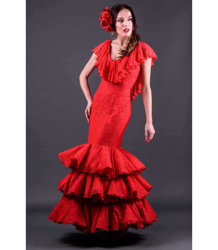
I've been really liking the green and red pallette. Something about the spanish design is really appealing.
I pulled this piece by Caravaggio for color reference. I put in on a layer on top of the painting and used it for color inspiration. Note how it's 90% very earthy, but the other 10% is very vibrant. That makes an interesting contrast and makes the focal point very clear.
I went back and added more texture to make the space feel more "lived in" in.
Homework:
Paint one story moment. Keep it at around 3-4 hours.