Saturday, September 29, 2018

Heidi Wk 3 - Convention Sketch

Here's the 8 Thumbnails, they're a combination of imagination, character substitution in existing reference layouts, and recreations of existing images that I liked.  I was unconcerned with capturing likeness, just working on playing with layouts and values.


Here's some reference images I used for those:


And here's the one I decided to work up, 9x12 on Bristol Vellum.  Got brave and used ink and a brush, as well as my copic liners, and Liquitex marker pens.  I was interested in popping out the blood by doing it in a different medium than the rest of the image, and in bringing foreward his face by having it contain the only whitespace in the composition. 

Here's the reference for this image: 
I chose to extend the spread of his blood, to enhance the rhythm of an otherwise provocative but pretty flat shot from the show. 


Thursday, September 27, 2018

Poster examples: Kim's Convenience

Hi all,

There's a really funny Canadian Korean sitcom called Kim's Convenience and a poster was made to represent every episode's theme.  I think a lot of these are great.  It's also nice to see a variety of styles and approaches in drawing plus design.

Some are story moments that are composed for a poster format.  Check these out.

https://www.cbc.ca/kimsconvenience/m/blog/kims-in-posters-a-look-back-at-season-2

Thursday, September 20, 2018

Homework week 1+2 review

Thanks for doing all of the good work on the homework guys!  Here is the review and feedback video.


Monday, September 17, 2018

Week 4 lecture - graphic composition and portraiture

Hey gals,

 Video 1 for this week is about how to study graphic compositions.  How do we study from masters old and new?  Well, master copies of course!

Video 2

Video 2 is two portrait demos, one of Katherine Winnick from the TV show Vikings and one is of Robert Downey Jr.  No matter how good and clever our compositions are, we still need to be able to draw great portraits in order to execute a finish piece.

Let's start to think about what you want to do for the final project; a poster or a story moment illustration.

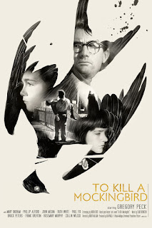
If you're going to choose a poster then think about whether or not you would like to use the collage look or the double exposure.

Also, there is a neat cell phone app that lets us light the head and view it in any angle.  It even lets us select light colors.  There are options to use one, two or three lights.  Pretty neat tool to get ideas on how to render lighting on the head and hands.  It also includes the planar head model and you can purchase animal skull references also.  Check it out.

http://www.handyarttool.com/

Demos:

Reference:


Reference:

Graphic Composition studies


Reference images for graphic compositions.


Homework:
Find your favorite posters, book covers, illustrations, and paintings.  Do ten master copies, 10 minutes each.  Only focus on composition and graphic simplification.  3-4 values max. Please post your reference images.  Thanks!

Do one head drawing of your choice but make sure your reference has direct lighting like the Robert Downey Jr. demo, no ambient lighting.  Keep it basic and don't spend more than 2 hrs.

Extra:
When you guys have time, read this article and bookmark this blog for further art notes.  It's great stuff!

http://www.muddycolors.com/2014/07/using-shape-and-value-for-better-compositions/

Sunday, September 9, 2018

Leen Week 2 - 3/4 Figure Sketch Cards

A couple quick sketches of two characters for a short comic I'm working on. Used the quill and Windsor & Newton Ink (951) and was disappointed to find that it bled in places. An interesting struggle to see how I could make it work despite the setback. 

Not satisfied w/ the design but tried to capture a figure walking w/ out of focus branches in the foreground. 

Doge is an angry boi. 

Saturday, September 8, 2018

Week 3 video lectures - The Convention sketch - Composition, Thumbnails, Pencilling, and Inking

Hi all,

Sorry it's been a crazy busy week so I'm a bit late.  Thanks for all of the hard work on the homework!  Great work and I'll post draw overs soon!  Here are the two lecture videos for this week.  Let me know if you have any questions and or comments on anything!

First Video - Thumbnails and Pencilling

Intro to inking
https://youtu.be/EpHzKRnGq3c
https://youtu.be/pfC6GNypik0
https://youtu.be/NnElVL1JMC8

Second Video - Inking Techniques


Inking Techniques:

Line Variation - Thicker on the opposite side of the main light source.  Thinner closest to the light source.

Hatching - using a series of lines to represent a value in an area.

Cross hatching - hatching on top of hatching

Feathering - hatching with one end of the lines being thicker, creating a teeth or comb like look.

Dry brush - using the brush when there is very little ink loaded creating a loose texture.  You can use this with watered down ink also.

Ink Wash - watering ink down with water to achieve lighter gray tones

Splattering - also called using the toothbrush.  Flick the bristles to create a spray pattern.  This creates a tone, great for atmosphere and to soften areas.

Homework:
Do 8 thumbnails and one convention sketch in black and white only.

Handouts

The idea cheat sheet for convention sketches.


Composition Breakdowns

Mad Max thumbnails 2"x3"


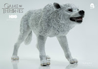
Toy figures make great references!


Film still reference

Final Convention Sketch


Reference for special effects


Heidi Week 2 - 3/4 Figure Sketch Cards

Hooray for free Saturdays!  Hadn't started any of these till this morning, and got em all done in about 8 hours today.  Another case of being intimidated at the outset, and super pleased with my work at the end :-).  Even tried out these newfangled watercolor paints.

A couple are pretty direct reproductions of source images, but I made sure to challenge myself to create something new. 


Thursday, September 6, 2018

Heidi Week 2 - 2 minute poses

This is my second pair of quick sketch pages.  Lots of room for improvement, but already better than the first!  Nice to have a way to get the bad drawings out fast :-)

Saturday, September 1, 2018

Week 2 - Sketch card poses 3/4 figure

Hi gals,

This week we're doing four more sketch cards but they will be 3/4 figure.  Meaning we crop at around mid thigh. This means that the heads will be so very small.  Don't worry about drawing pretty faces here.  Just find an interesting character pose.

First part of the lesson covers basic figure proportions and ten things to look for.

Second part is about gesture (rhythm or sweep) and how to measure quickly using plumb lines to see negative shape.

Use these sites to practice the quick sketch. Do a two pages of 2 minute poses. Fit about 8 poses on each page. Use that gesture and measure using negative shapes!  Keep it simple and breathe while you draw!

https://www.quickposes.com/en
https://line-of-action.com/practice-tools/figure-drawing/

Third part is a sketch card demo.  Try to use everything from above; proportions, gesture, and shapes!

Demo
Daredevil

Thor

X-23


Handouts
Super Basic Composition notes


Every piece will have a primary direction.  However, it's possible for an action in the frame to move counter to the main direction.

The second example shows that you can and should have a low contrast area or high contrast areas within one piece but every decision should drive attention towards the main focal point.  If a line drawing is boring, it can still be lit in an interesting way if you design the shape of the light.

For home work, draw 4 sketch cards with 3/4 body or more.  Think about basic composition.  I'll give you notes on your homework by next Saturday.  Thanks for the awesome hard work! :)